Kindred: Private health insurance just got personal
Strategy. Proposition. Name. Identity. Launch Campaign
-
A growing concern
Health insurance used to be thought of as a work-related perk. Private medical cover was not relevant for Joe Public. But times have changed. The NHS is facing unprecedented challenges and its resources are thinly stretched. Accordingly, more and more families are considering taking out insurance so that they can access treatment they may require.
The Alliance Health Group has provided medical insurance to leading companies for 20 years. The business was set up by a group of doctors who wanted to make sure that employees received high-quality care at a time and a place that suited their needs. With more people thinking about ‘going private’, Alliance decided to explore the viability of providing their services directly to people. They commissioned Chromatic to help them size and analyse the market. We conducted extensive desk research and surveyed over 600 prospective customers, segmenting the audiences and determining an opportunity space.
-
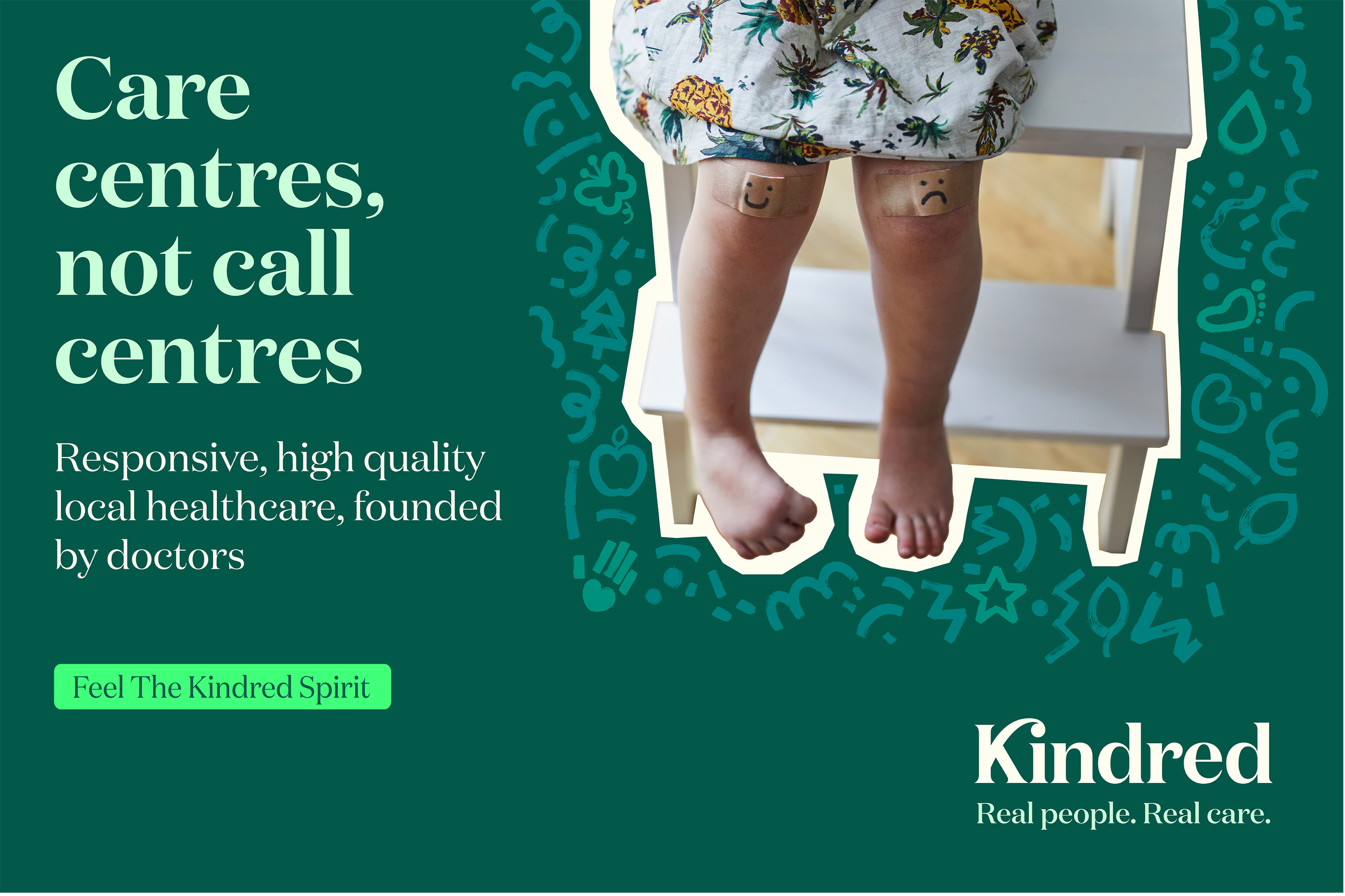
Care centres not call-centres
Alliance offers a superior service: knowledgeable, empathetic claims handlers who can provide swift access to a hand-picked pool of doctors.
But ‘better’ is only meaningful by comparison, so we advised Alliance to focus on people with previous experience of medical insurance, either through their employers or self-funded. Our target customers are people who appreciate the value of empathetic and expert service.
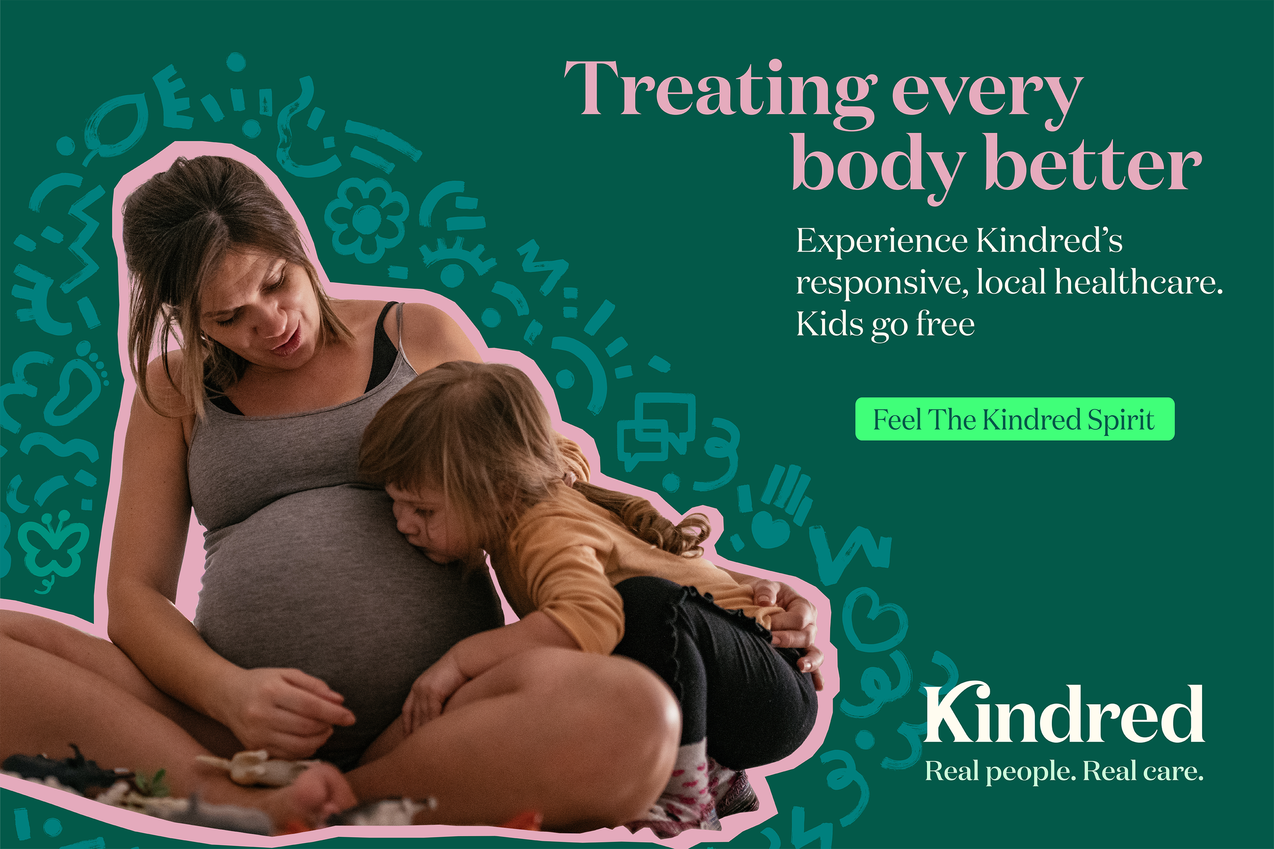
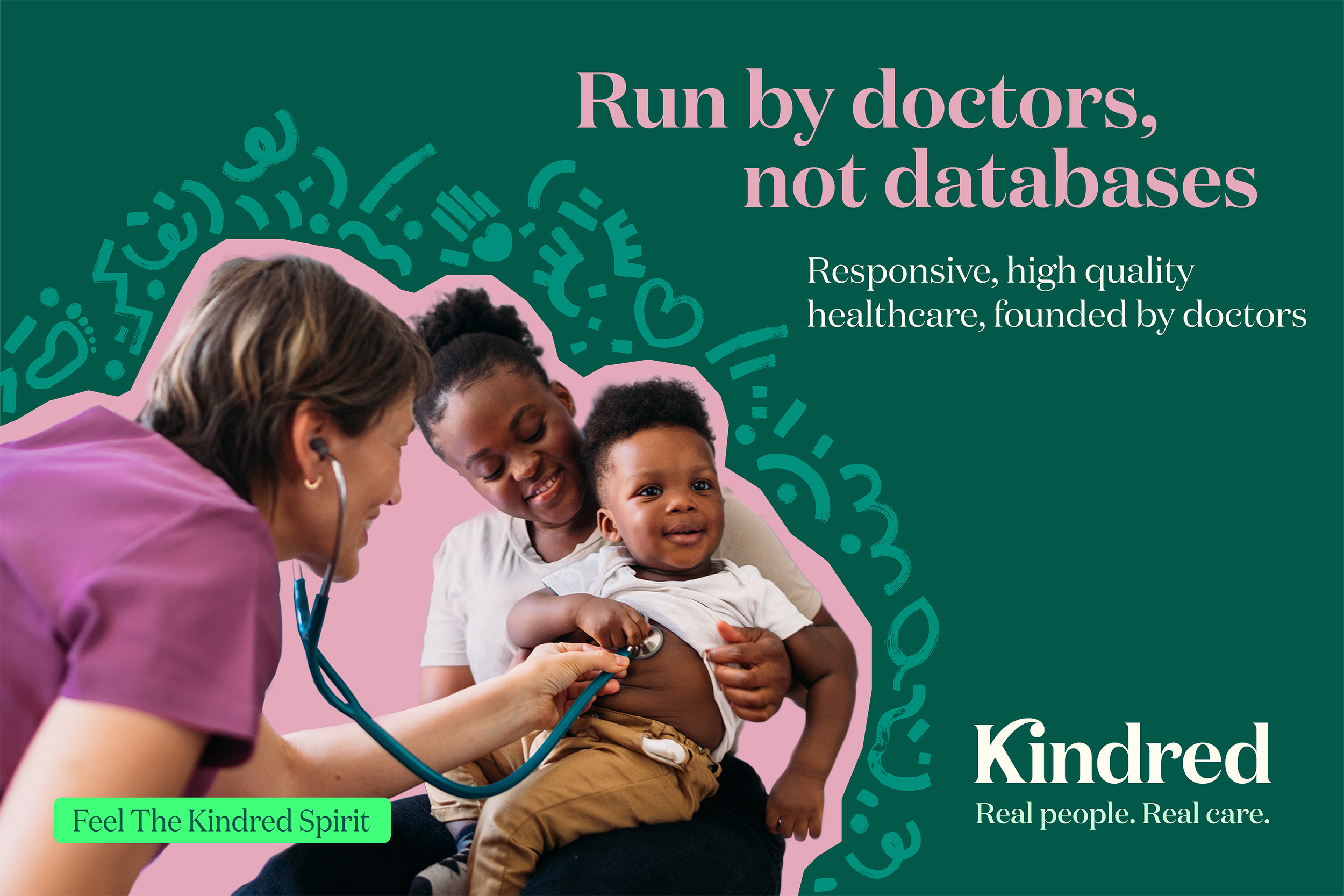
We decided to build a business that built upon Alliance’s reputation for quality care and leveraged the fact that they are run by doctors not by bean-counters. And to challenge the conventions of the market and offer a real choice, we concluded that the Alliance brand should focus on care for families not just for individuals, and for ordinary people not just a privileged elite.
-
Experience the Kindred spirit
Unlike the big beasts of the insurance world, Alliance believes in building relationships with its customers and partners, not just managing transactions. We wanted to capture this spirit of togetherness and evoke the human touch in our branding. The name ‘Kindred’ helps to position the brand as personal and family-centred. It’s distinctive, memorable and easy-to-say - translating a charmingly old-fashioned word into a highly contemporary brand.
-
Real life is messy
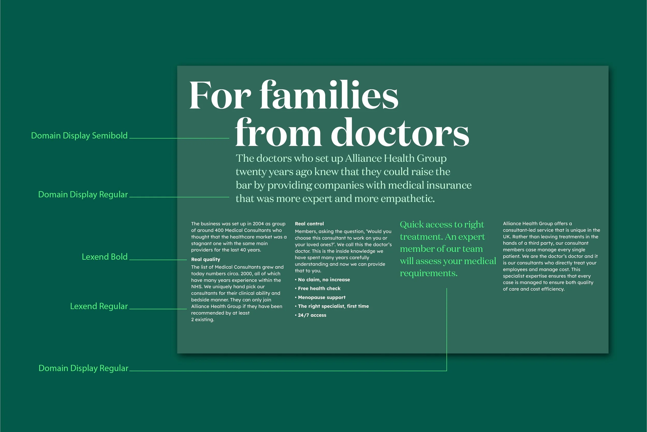
To show that Kindred ‘gets’ the real lives of real people we have created a visual identity that exudes relatability. Kindred is a warm word crafted with care - the ligature between K and I suggests a hug. And the display font - Lexend - was specifically designed to help people with reading difficulties,
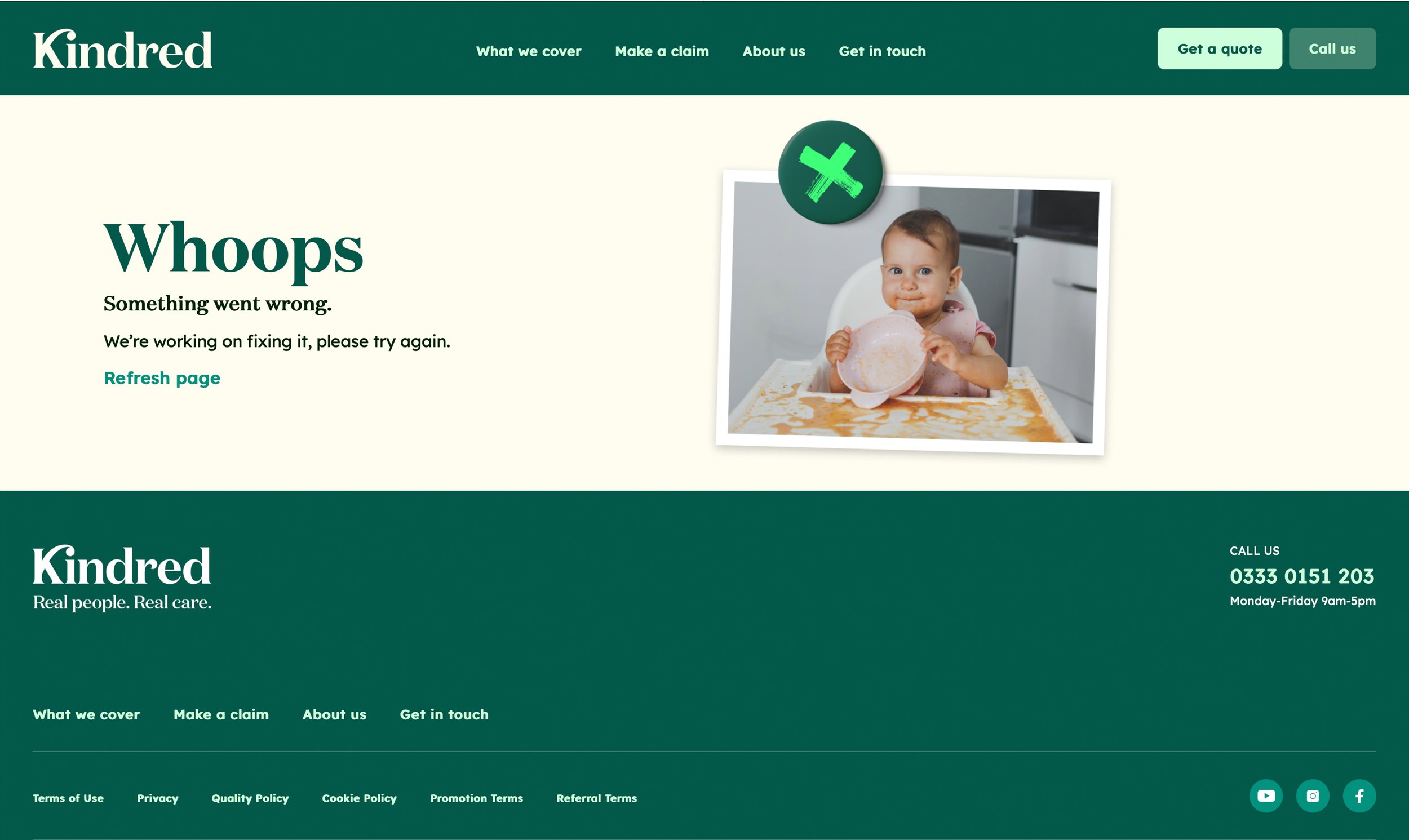
Colour palette and imagery break the ‘rules’ of the category, evoking normal households rather than clinical spaces. And to enrich the distinctiveness of the Kindred world, we built a graphic language based on the idea of a fridge door – the white board for family memos and mementos - creating a distinctive and engaging system that incorporates notes, magnets, cut-out photo’s, snapshots and doodles.
-
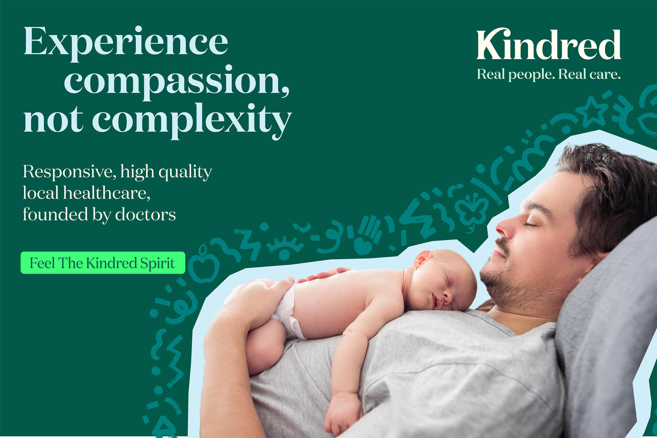
Compassion not complexity
The Kindred digital platform will be central to the success of the business. Our challenge was to design a coherent interface for a complex set of functions - a quote engine, health data, CRM, claims handling and referrals. The watch-words for user experience design were simplicity and support.
Copy and content provide guidance and build confidence, delivering serious information with an informal but never frivolous tone.
-
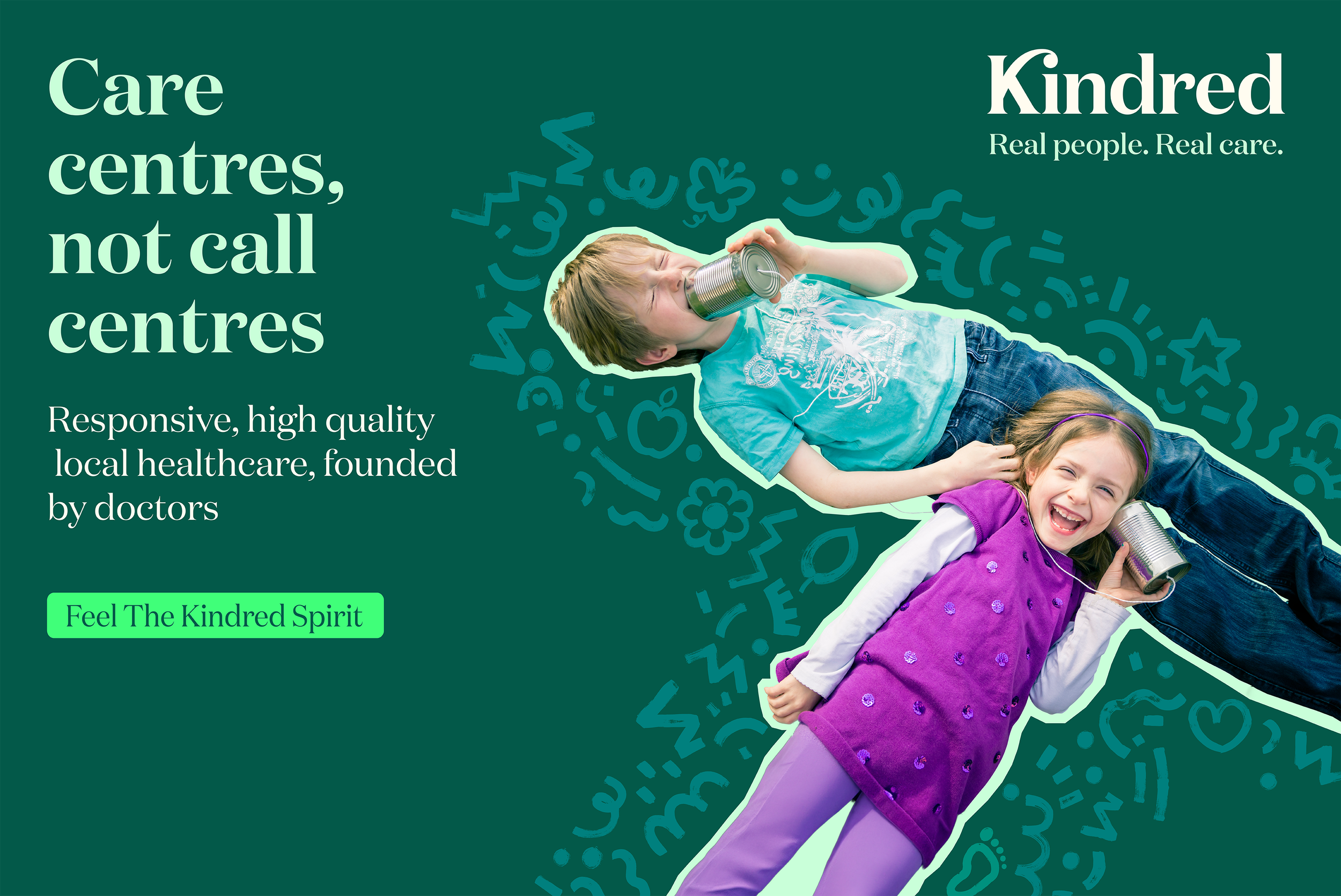
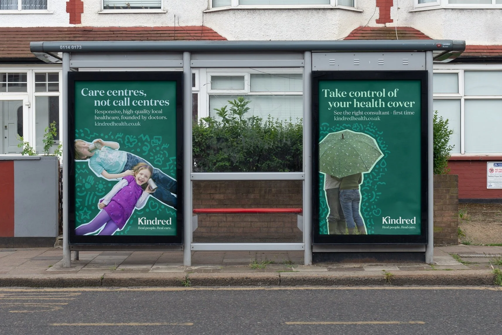
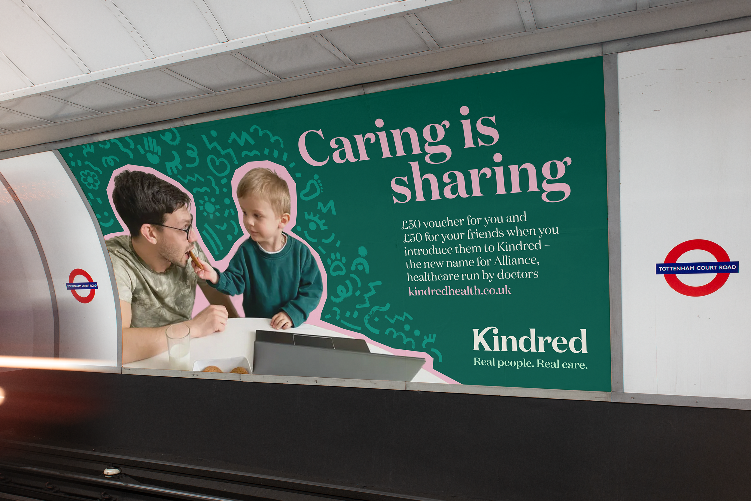
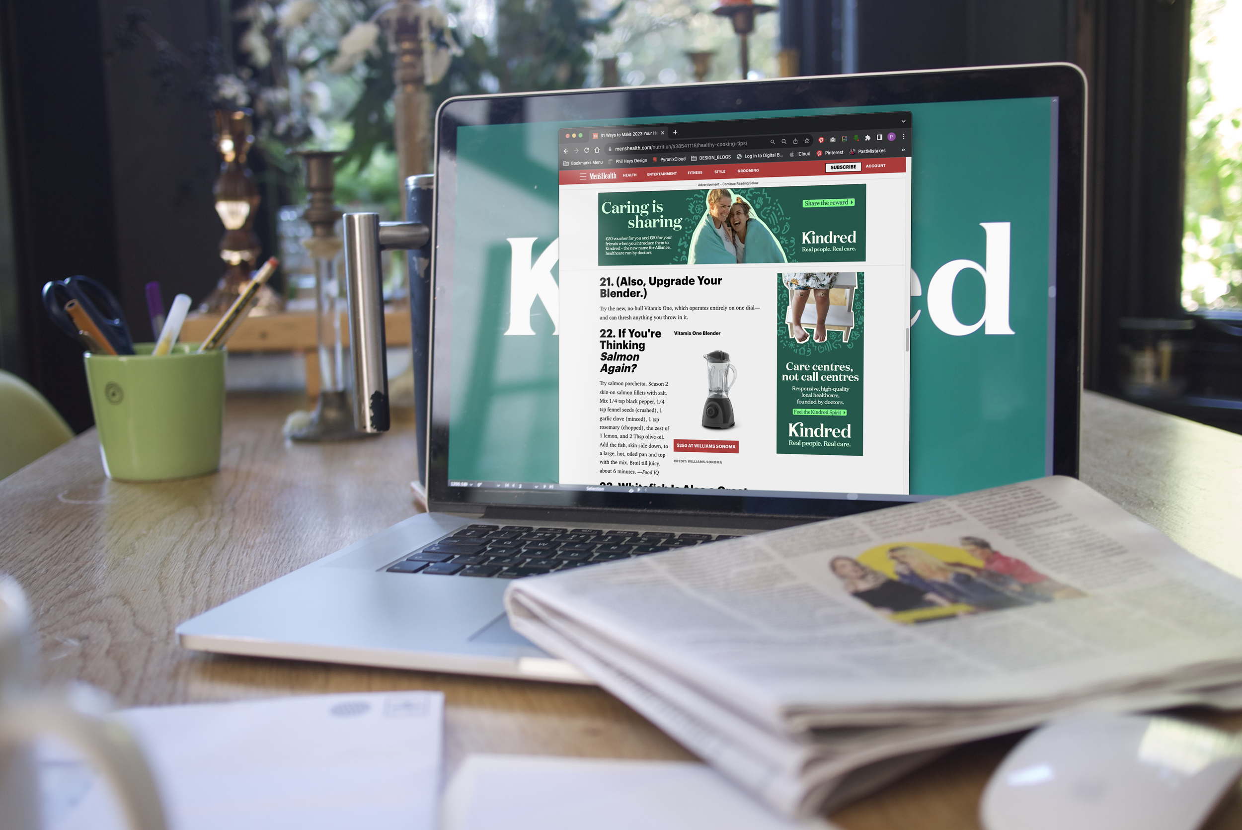
Competitors present idealised lives: Kindred shows the reality. Images of sneezing children, exhausted parents and messy houses, paired with witty headlines, add up to a campaign that will raise a knowing smile. Delivered through over 400 different adaptations, the campaign includes films, different adverts, phone messages and social channels.
TV spot
