Case_study_hero_images_insurance.png

Thinking

Latest: anti-bullying charity Kidscape gets a rebrand to reach teenagers as well as kids

Kidscape_T-shirts_MockUP.jpg

First published by Design Week, November 13, 2018. Written by By Alina Polianskaya

The organisation, which offers practical support and advice to children, young people, families and schools, has been given a new identity by Chromatic Brands in time for national Anti-Bullying Week. Chromatic Brands has rebranded anti-bullying charity Kidscape in a bid to make it appeal to a wider audience and create a stronger sense of identity.

 
kidscape_logo_develop_lr.jpg

The new branding coincides with national Anti-Bullying Week which aims to raise awareness and help combat the issue, this year with a focus on the theme “Choose Respect”. It runs from 12-16 November. Kidscape provides advice, learning resources and practical tools such as workshops and assertiveness training to help prevent bullying and support children, young people, schools and families. It also highlights the issue among professionals and policy makers as part of the Anti-Bullying Alliance coalition. As well as helping children of all ages who are being bullied, the charity aims to educate others such as friends of bullied children, families and bullies themselves, according to the design studio, and so was keen for the branding to reflect this. The brief was to create an identity that would make the charity more “accessible, current, relevant and practical for its different users”, to “destigmatise bullying” and to “empower” children to help each other, says Simon Case, global creative director at Chromatic Brands.

 
Kidscape_Pins_MockUP_lr.jpg

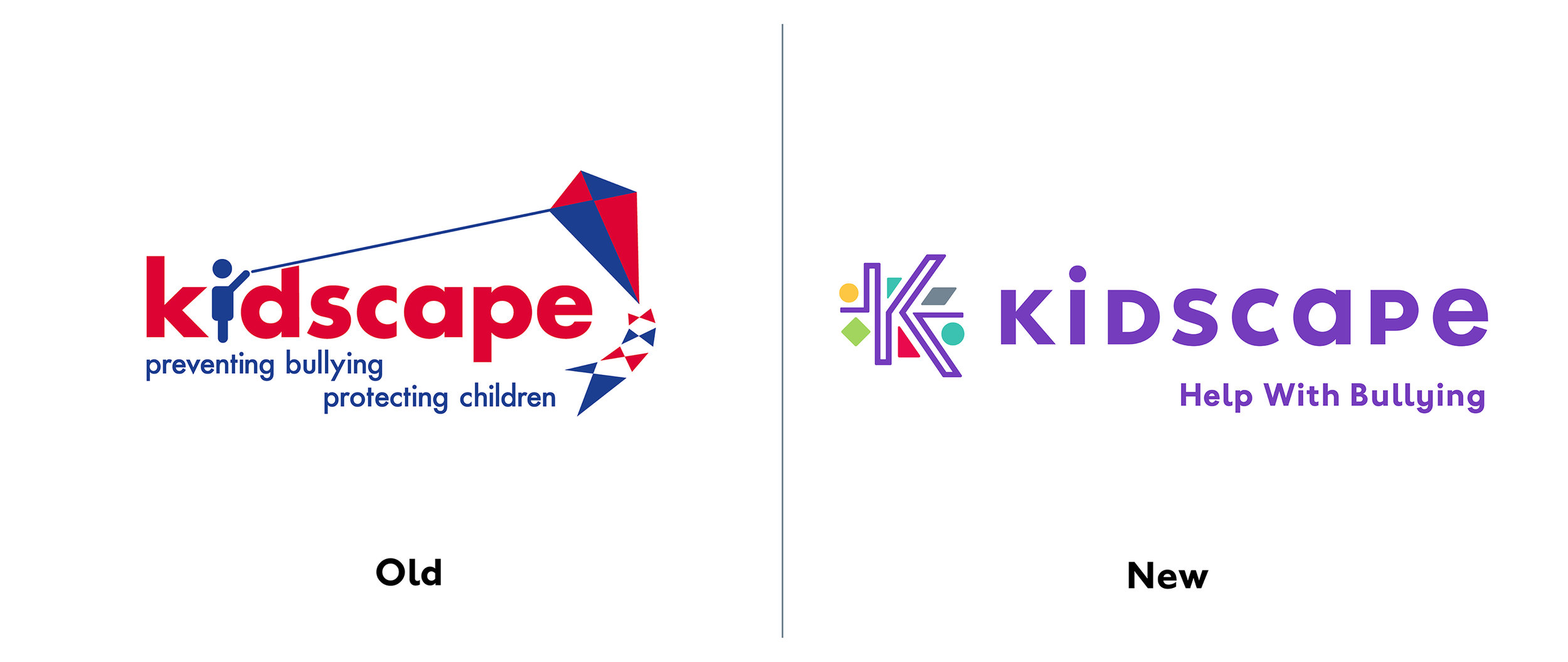
He adds that the new branding has helped the charity define what makes it “different and special” among other anti-bullying charities, in that it specialises in providing practical help. Focusing on this idea, Case says the studio has aimed to make the language more “solution-orientated”. The tagline “help with bullying”, has replaced the old line of “preventing bullying, protecting children” to highlight the “practical” nature of the charity’s services, he says. Case adds that the charity had originally set out to appeal to younger children, but as this had been “alienating some of the most vulnerable teenage groups in need of help”, Kidscape wanted the new branding to appeal to people of different ages. The old logo featured the word “kidscape” in lower case letters, with a child figure in place of the “I” holding a red and blue kite.

 
Kidscape_Enamel_email.jpg
Kidscape_Posters_email_02.jpg

This has now been replaced by a “K” logo and the word “Kidscape” in a mix of upper and lower-case letters set in sans-serif typeface ITC Johnston. The logotype has been created alongside type designer Dave Farey. Case says the “K” logo, which is made of a single winding purple line weaving through multi-coloured geometric shapes, has been informed by a quote from one child who approached Kidscape for help: “Dealing with bullying was like trying to navigate a maze”. “Using this idea, we created a striking ‘K’ symbol for Kidscape which illustrates how the charity helps people to ‘find a way’ through the maze, while forming the foundation of the design system,” Case says.. “This system uses details of the ‘K’ symbol and is purposely bright, optimistic and hugely differentiated from the sometimes ‘doom-laden’ vernacular of other organisations dealing with similar issues,” he adds. The shapes within the logo are magnified across branding materials, he adds. The colour palette  includes purple, green and yellow and is used alongside imagery which aims to support the charity’s positive message and “enable flexibility”. The identity created by Chromatic Brands is being rolled out across a range of assets such as presentation materials and templates, promotional and sponsorship materials and social media, while a website redesign is currently underway. The studio drew on a study into bullying by Meridian West business and research consultancy, to identify trends and insights into bullying and awareness of Kidscape as a starting point for the project. It consulted with children and young people, parents and carers, teachers and the wider anti-bullying sector to ensure the branding appealed to both younger and older audiences. The rebrand was a paid-for design project, but at a “significantly reduced rate”, says Case, given the worthy cause.

During national Anti-Bullying Week, Kidscape is raising awareness and promoting Friendship Friday throughout UK schools, which encourages “friendship, anti-bullying and inclusive behaviour”.

If you would like to help Kidscape, please donate at https://www.kidscape.org.uk/

 
Kidscape_Dev_Stage_01_WS_2018_v03_lr.jpg